Project Overview
Fiore is a floral arrangement and purchasing app. Fiore strives to make the process of choosing pre-made and/or customizing floral arrangements to send to loved ones easy and simple for everyone, especially for those on-the-go!
Project Duration: March 2022 to April 2022
-
I am the UX Designer and Researcher for the Fiore App from conception to delivery. I conducted research and interviews, made paper and digital wireframes, created low and high-fidelity prototypes, conducted usability studies, accounted for accessibility, and iterated on designs.
-
Busy workers do not have much time to spend on customizing bouquets, especially those who are not tech savvy, to send to loved ones.
-
Design an app that makes customizing and purchasing floral arrangements for others easy and simple.
Design Process
Understanding the User
I conducted interviews (online and in person) and made a questionnaire in Google Forms for the users to fill out. This was used to help me understand the users I am designing for and their needs. A primary user group identified through research was working adults who don’t have time to figure out an app to send flowers to loved ones.
This user group confirmed initial assumptions I had about how customers want to purchase floral arrangements online, including easy navigation and drag-and-drop abilities to see your own creations. Other user problems included wanting to have pre-made bouquet options for quick purchasing and easy to read text.
Pain Points
Options
Filters and pre-made options for floral arrangements could lessen the hassle of buying bouquets through an app.
IA
Simple navigation and easy-to-read text to be able to arrange and purchase flowers seamlessly.
Accessibility
Platforms for arranging flowers are not equipped with assistive technologies. Some apps have information overload and is overwhelming to users.
Time
Working adults, even those who work from home, are busy. They need an app that does not contain many pop-ups to ruin their purchasing experience.
Primary Persona
Oliver is a busy nurse who needs an easy app experience to send customized flowers to loved ones. He is always on-the-go, does not have much free time and is not technology savvy.
Secondary Persona
Daisy is a work from home production coordinator who relies on online shopping to get what she needs. She wants the product that gets sent to her to represent what she sees online.
User Journey Map
Mapping Oliver’s user journey revealed how helpful it will be to have an app dedicated to easily arranging, choosing, and previewing floral arrangements to send to loved ones.
Competitive Analysis
I researched direct and indirect competitors that provided a similar product to Fiore. I conducted a competitive audit and noticed similarities between the competitors, however, Fiore can take advantage of the feature of customizing and purchasing a bouquet quickly and efficiently within an app. It is a one-stop shop for bouquet needs. It can provide a quick service that other competitors do not.
Starting the Design
I kept in mind the research I did and the needs of users as I worked through the initial designs of Fiore. Thinking about the pain points users encounter, I was able to create a simple user flow and work on design concepts to create an efficient and easy to navigate app.
User flow from homepage to checkout
I thought about how users can get from the homepage to checkout the quickest way possible, while still being able to customize their order.
Storyboards
Creating storyboards helped with getting in the mindset of the user and how they would be able to benefit from using this app. I created a “big picture” storyboard as well as a “close-up” storyboard to help with the initial designs of Fiore.
Paper Wireframes
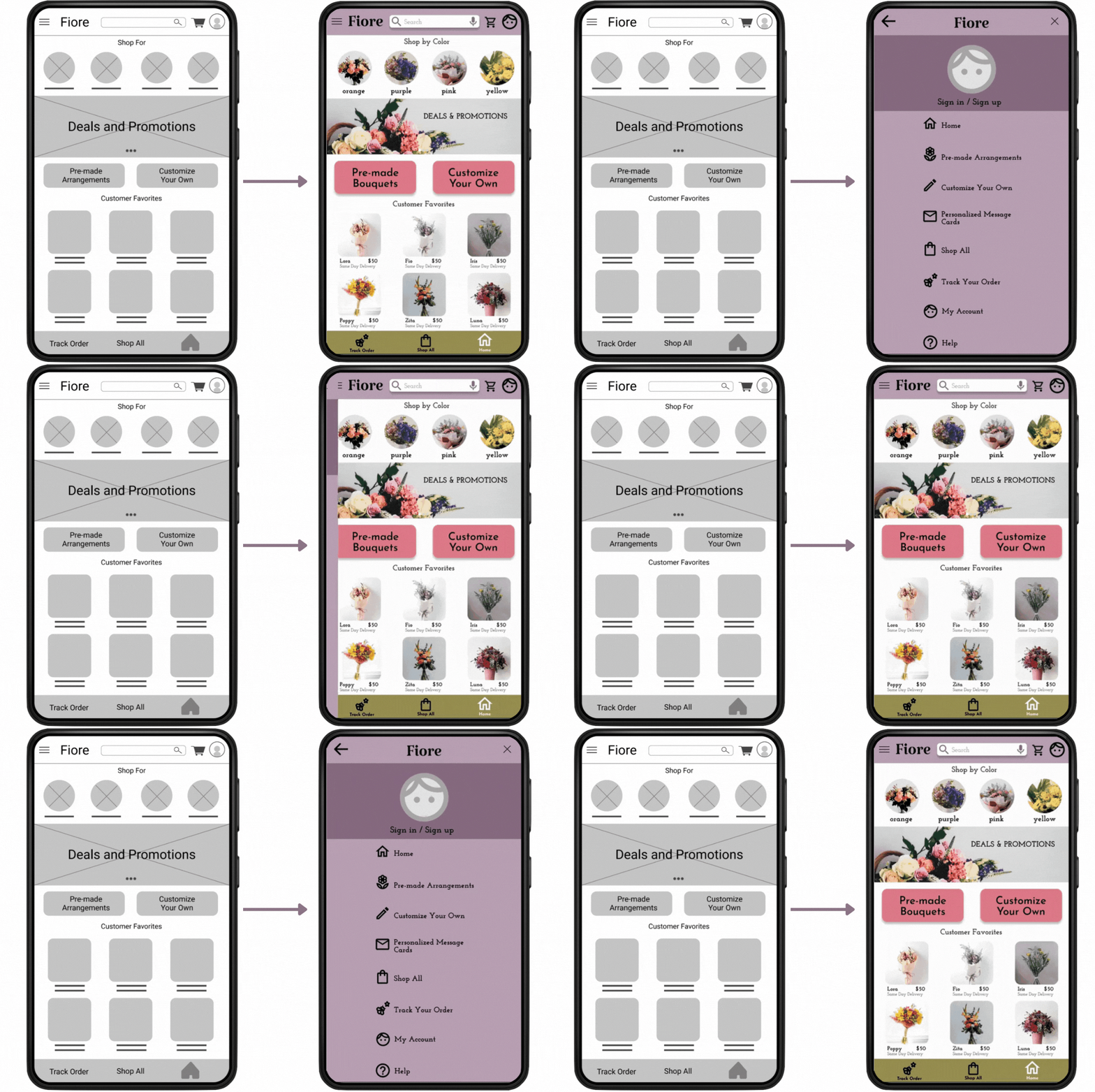
With the main focus being sending flowers to loved ones in the easiest way possible, I made wireframes that were more image driven so the user can easily determine what they want to do when on the homepage.
*Stars were used to indicate the elements that would be used in the initial digital wireframes
Digital Wireframes
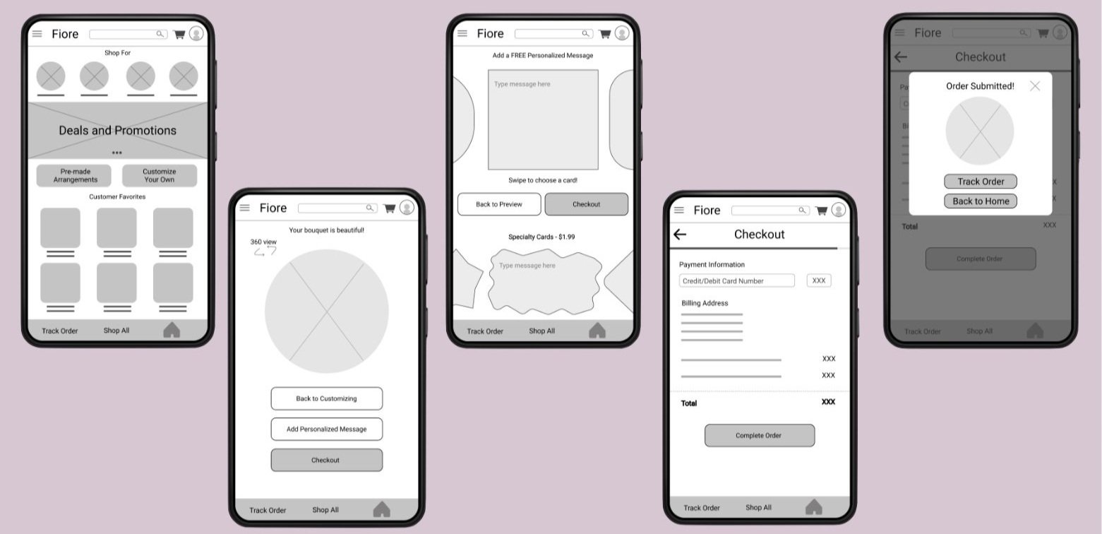
As I began to design, I kept in mind that users were looking for ease when using this app. I used research and feedback from user research as basis for my initial designs.
Easy navigation was essential to address user needs. Having the options available to users makes the process of purchasing and sending flowers seamless.
Low-fidelity Prototype
This low-fidelity prototype connects the primary user flow of browsing/ customizing floral arrangements to completing an order, so that it can be used in a usability study with users.
Usability Studies
I conducted two rounds of usability studies. The findings from the first study helped guide the designs from wireframes to mockups. The second study was done using a high-fidelity prototype and revealed what features needed refining.
Research Plan
I created a research plan to follow a structured usability study. I believe creating this allowed for feedback to be more organized and well thought out. Each user was asked the same questions, therefore data was more consistent.
Research Observations
Once the usability studies were done, I gathered a lot of information about what users felt as they navigated through the app via the prompts that I provided. I then made affinity maps to help organize users’ thoughts and overall feedback of the app.
Research Findings
After reviewing, analyzing, and synthesizing both usability studies, through affinity mapping and identifying themes, I found the top insights to be able to iterate my designs. I used these insights to make and modify a high-fidelity prototype.
Refining the Design
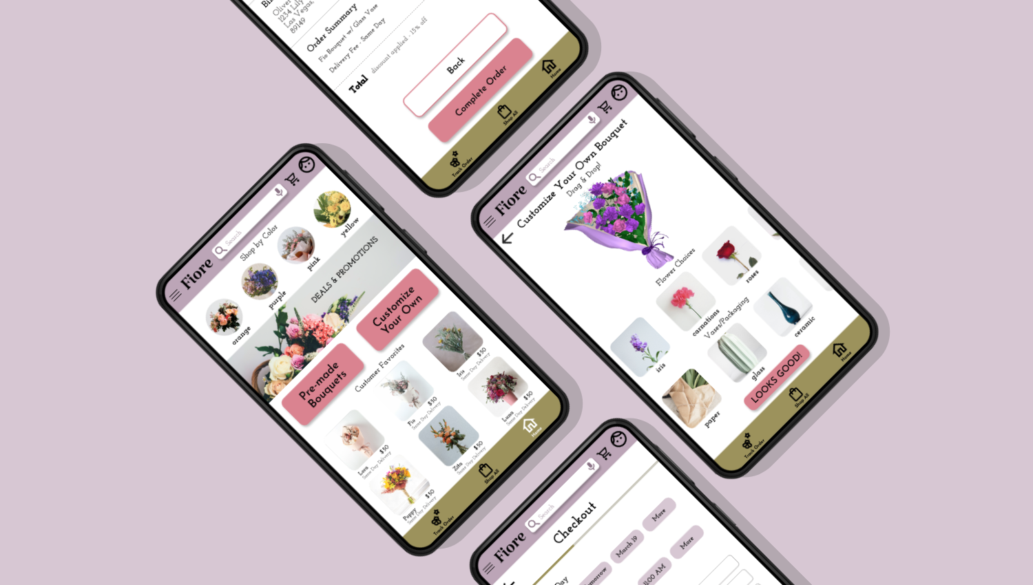
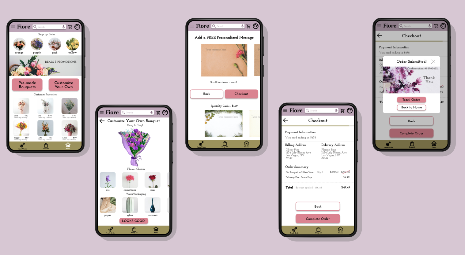
After the usability studies and organizing insights, I was able to iterate on my designs and create a high-fidelity prototype that addresses the pain points of users. The app’s navigation provides ease to the user as they go through customizing a bouquet and checking out.
Simple Navigation
Early designs focused on heavy imagery, but after the usability studies, I made the buttons to start the user flow much bigger and clearer. After the first usability study, users wanted clearer buttons to simplify navigation right when they enter the app.
Easy Checkout
During the second usability study, users were frustrated because there was no way to put the promo code during checkout. A confirmation number was also unavailable. I added a text box to put a promo code and the confirmation number is available after purchase.
Accurate Customization
After the second usability study, users wanted a more accurate representation of the “drag & drop” feature that the app has to offer. I modified the customization portion of the app to show how a “drag & drop” feature could work. Users are now able to drag and drop flower choices to make a bouquet.
Accurate Features
After the second usability study, users wanted a more accurate representation of the “360 view” feature of the app. I modified the bouquet preview page for users to see how the “360 view” feature could work. Users can now move the bouquet to have a 360 degree view of their creation or choice of arrangement.
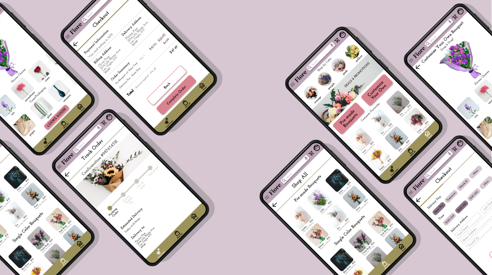
High-fidelity Prototype
The final high-fidelity prototype presents a simple user flow for customizing a bouquet and checkout. It met user needs for easy navigation and accurate representation of the process.
Style Guide
I came up with a style guide to have consistency throughout the app. I chose colors that would stand out, but still have a calming effect while browsing. The button colors are meant to pop out so users can easily navigate through the app. There are icons that make it easy for users to choose where they need to go. The typefaces and fonts compliment each other and are can be read well.
Accessibility Considerations
Throughout the design process, I thought of ways to make sure my app was accessible and user friendly. Here are a few ways that makes this app accessible:
The color combinations throughout the Fiore App meet at least the minimum requirements of WCAG. The colors of the buttons stand out and help users navigate the app with ease.
The use of icons and imagery help users easily identify where they need to go throughout the app. The app is heavy on imagery, but uses negative space to present a neat UI.
There is a speak to search option to make it easier for users to find what they are looking for within the app.
Takeaways
The app makes users feel like there is a simple and quick way to customize and purchase bouquets for loved ones.
While designing the Fiore App, I learned that initial designs can change multiple times throughout the process. I also learned that usability studies and feedback are necessary to move the design in a positive direction.
“I had fun with the features the app offered to customize bouquets! It was user friendly and very pretty!”
Next Steps
-
1
Conducting another usability study would help realize if pain points that users encountered were effectively addressed.
-
2
Conduct more user research to determine what other user needs can be addressed in the app.
-
3
Conduct more research on the competition to see trends and aspects the app could be missing to better the UX.
Thank you!
I made this case study and designed this app through the Google UX Design Professional Certificate Program. Thank you so much for taking your time to view my very first case study!
Please feel free to contact me!
Email: irakristelcaro@gmail.com
Website: https://www.irakristel.com/


