Project Overview
EMO (Emotions in My Ocean) is an app dedicated to help children, ages 4-12 years old, learn how to recognize and control the emotions and feelings that they might go through on a daily basis. EMO helps children understand that what they feel is valid and normal. This app has tips and tricks on how to overcome certain emotions and also share positive ones.
Project Duration: May 2022
-
UX designer leading the app and responsive website design from conception to delivery. I was in charge of conducting interviews, paper and digital wireframing, low and high-fidelity prototyping, conducting usability studies, accounting for accessibility, iterating on designs, determining information architecture, and responsive design.
-
Most children might not understand all the emotions they are feeling, which may cause confusion, tantrums, and anxiety. Children who recognize what they are feeling are more likely to be able to manage and regulate their response to these emotions.
-
Design an app that helps children recognize their emotions and learn strategies to help control and manage them.
Design Process
Understanding the User
I have been an elementary school teacher for the last three years, and we have dedicated times throughout the day to learn about social emotional wellness. I used what I know about the social emotional needs to develop interview questions, which were then used to conduct user interviews.
Most interview participants reported feeling a lot of emotions and would find an app helpful if it taught them about their emotions and also showed how to control them. The feedback received through research made it clear that users would want an app that could help them calm down, relax, and reduce anxiety whenever they are feeling certain emotions strongly, even positive ones.

Pain Points
Accessibility
Since a majority of the app’s users are children in elementary school, a text-to-speech feature is necessary for those who cannot yet read.
IA
Simple navigation throughout the app is a must for users to be able to complete tasks and user flows.
Experience
Users want to have a good experience as they navigate through the app. The app should be visually pleasing and easy to use.
User Personas
The personas I created were based off of the majority of the users that would most likely experience this app. These personas focused on wanting a simple app that would be able to teach them more about the emotions they are feeling and how to control and manage them. As I created these personas, I kept in mind the emotional needs a user might have. Many users that will use the app want to be able to access resources quickly and effectively the moment they feel strong emotions coming.

User Journey Maps
Mapping out both Jase’s and Kazi’s user journey helped with what elements I should focus on when designing the EMO app. Jase’s journey map focused on choosing the emotion he was feeling at the moment and then finding resources to calm down. Kazi’s journey map focused on finding tips and tricks to quickly combat anxiety.
Competitive Audit
An audit of a few direct and indirect competitors’ products provided direction on gaps and opportunities to address with the EMO app. I found that most products are strictly apps which feature games that allow users to learn more about their emotions. However, what they lacked were resources on how to manage and control their emotions.
Starting the Design
As I began the ideation phase of designing this app, I focused on the user’s needs and what would make it easiest for them to navigate through the app. Since the users of this app are primarily children ages 4 and up, I made sure to think about how the pages of the app cannot be overwhelming or text heavy. I also made sure to keep in mind easy access to buttons and simple navigation to complete user flows.

Ideation and Paper Wireframes
I used the Crazy 8’s ideation exercise to come up with initial ideas of how to address gaps identified in the competitive audit. My focus was providing a simple way for children to choose the emotion they are feeling and being provided resources to address them quickly.
Digital Wireframes
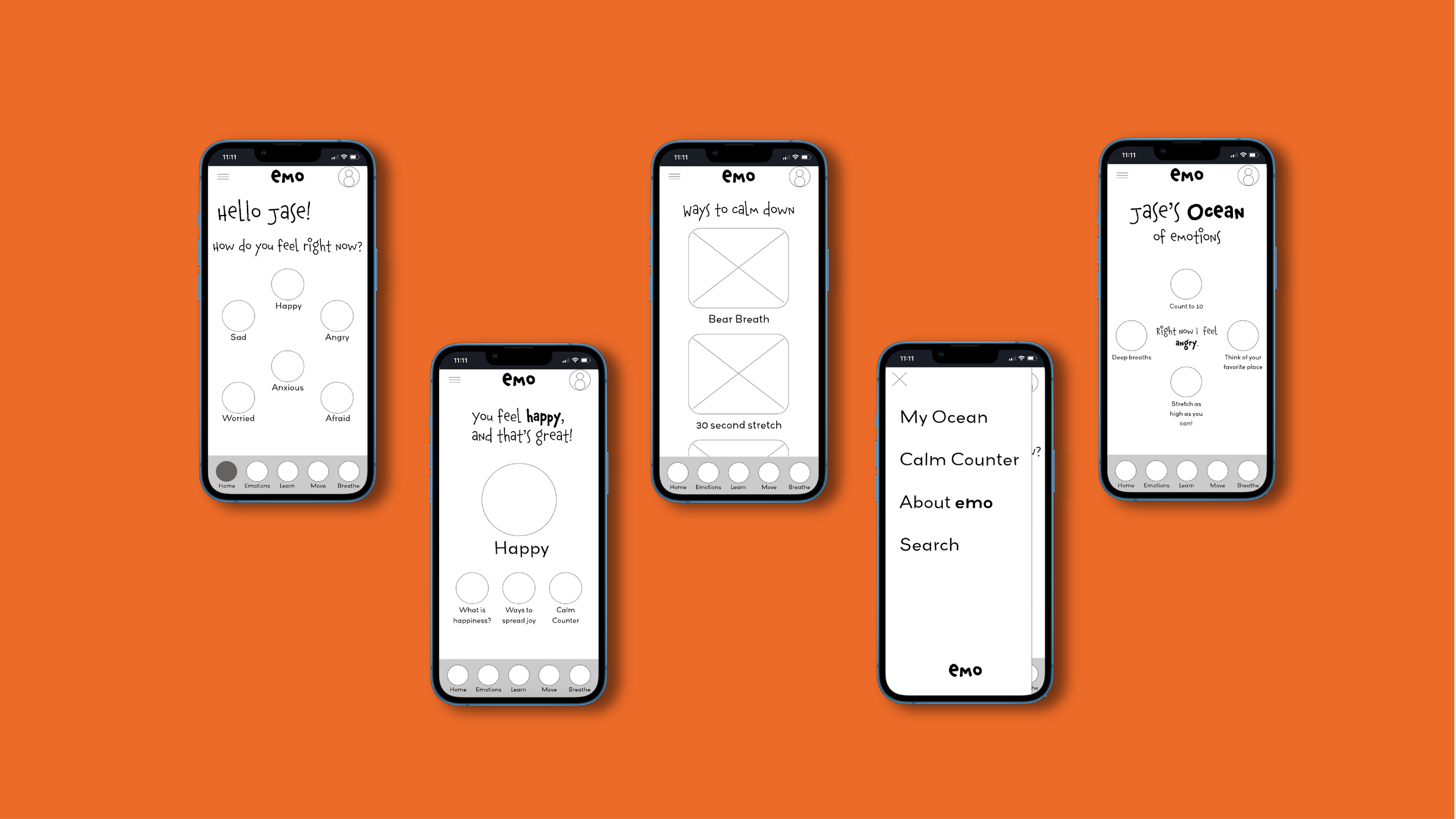
After ideating and drafting some paper wireframes, I created the initial designs for the EMO app. These designs focused on easy navigation for users to choose an emotion and access resources that the app provides.
Low-fidelity Prototype
I created a low-fidelity prototype to prepare for usability testing. It connected the user flow of choosing an emotion and finding strategies to help with managing that emotion.

Usability Study
I conducted a usability study for the low-fidelity prototype of the EMO app to further learn about user pain points and what needs to be addressed.
Research Plan
Having a research plan allowed the usability study to run smoothly. I was able to collect significant data from each participant while also seeing what frustrated and pleased them as they completed core tasks within the app.
Research Observations
By affinity mapping, I was able to organize the user’s thoughts and frustrations that they had during the usability study. I organized them into four main categories, which led to creating themes and insights to further iterate on in the design process. I was able to organize priorities into P0, P1, and P2 categories.
Findings
After conducting the usability study, affinity mapping, finding themes and insights, and prioritizing which features to work on, the main findings were:
Refining the Design
I began iterating on my designs after the results of the usability study. I worked on the main pain points that users faced during this round of usability testing.
Calm Down Option
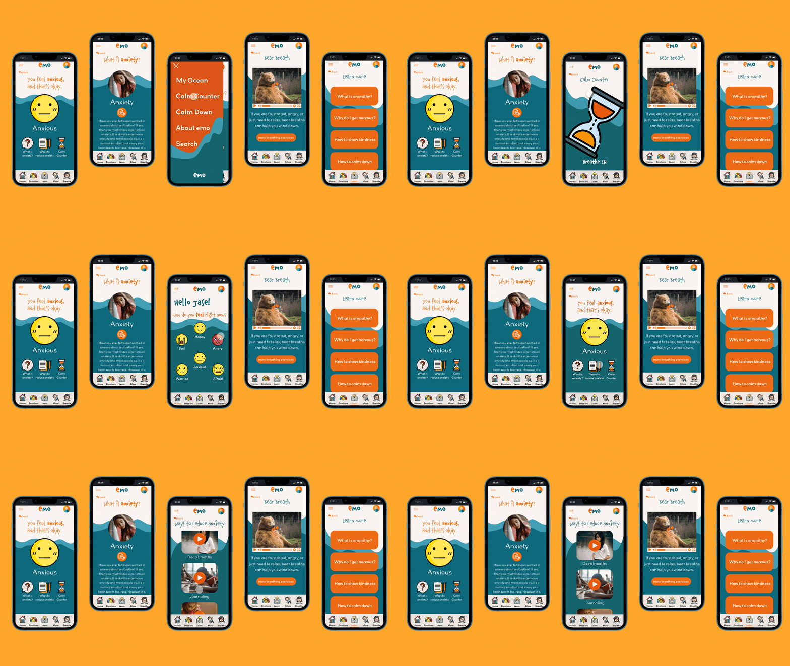
Based on the insights from the usability study, I applied design changes like adding a “Calm Down” option on the hamburger menu. This creates easier access for users to get to this page.
Navigation
Additional design changes included adding clear “back” buttons so that users can go back and forth between the pages they want to access.
Features
Another design change included a clearer indication of which page the user was on when going through the pages of the app. The navigation bar at the bottom now has an indicator on which page they are on when they tap it.

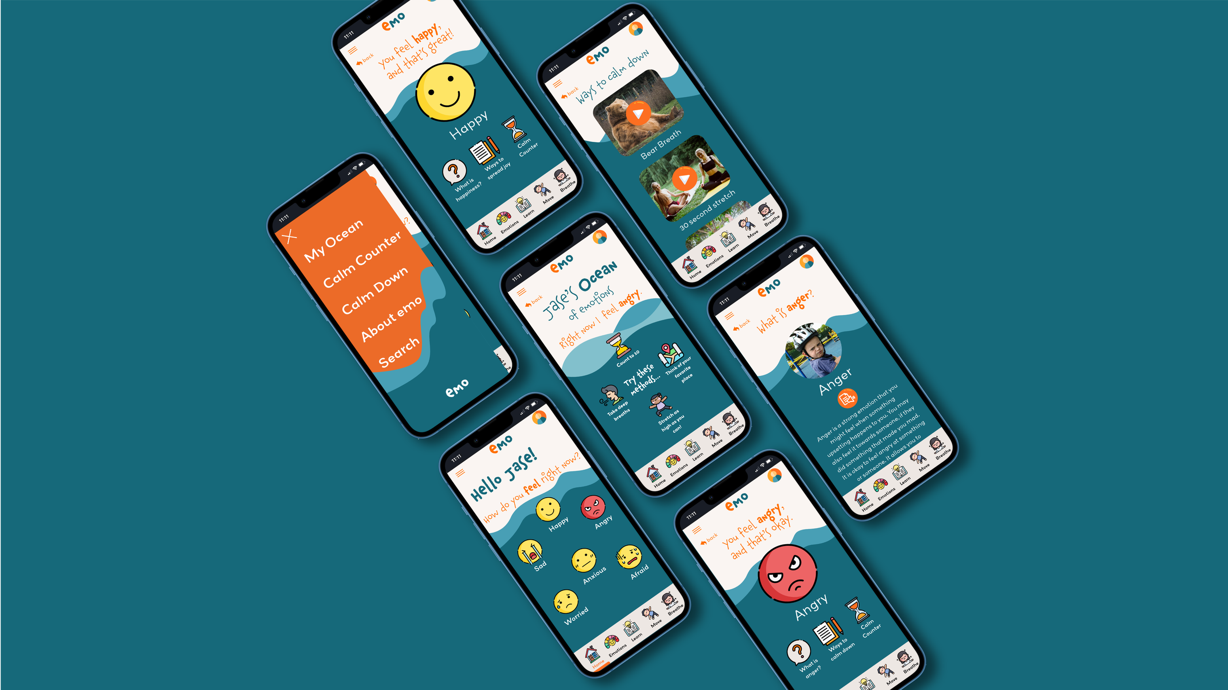
emo mobile app mockups
High-fidelity Prototype
The high-fidelity prototype followed the same user flow as the low-fidelity prototype, including design changes made after the usability study.

Style Guide
Having a style guide made sure that the app and the responsive website was visually appealing and consistent throughout all platforms.
Icons throughout the app are from flaticon.com, stock images throughout the app are from unsplash.com
Accessibility Considerations

Responsive Design
I used the progressive advancement approach when designing a responsive website for EMO. I used this mobile-first design approach because it focuses on a website’s most basic features and making sure it is accessible and easy to navigate. Designing for mobile first allowed me to really think about what the users truly need first and foremost, while thinking of the added features later on.

Sitemap
With the app designs completed, I started work on designing the responsive website. I created a sitemap for EMO to guide the organizational structure of each screen’s design to ensure a cohesive and consistent experience across devices.
Digital Wireframes Screen Size Variations
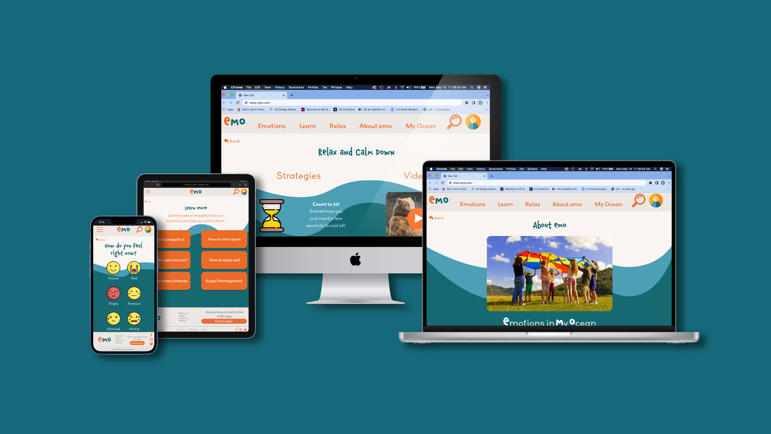
The designs for screen size variation included mobile, tablet, and desktop. I optimized the designs to fit specific user needs of each device and screen size.
Mobile Web Design
Tablet Web Design
Desktop Web Design

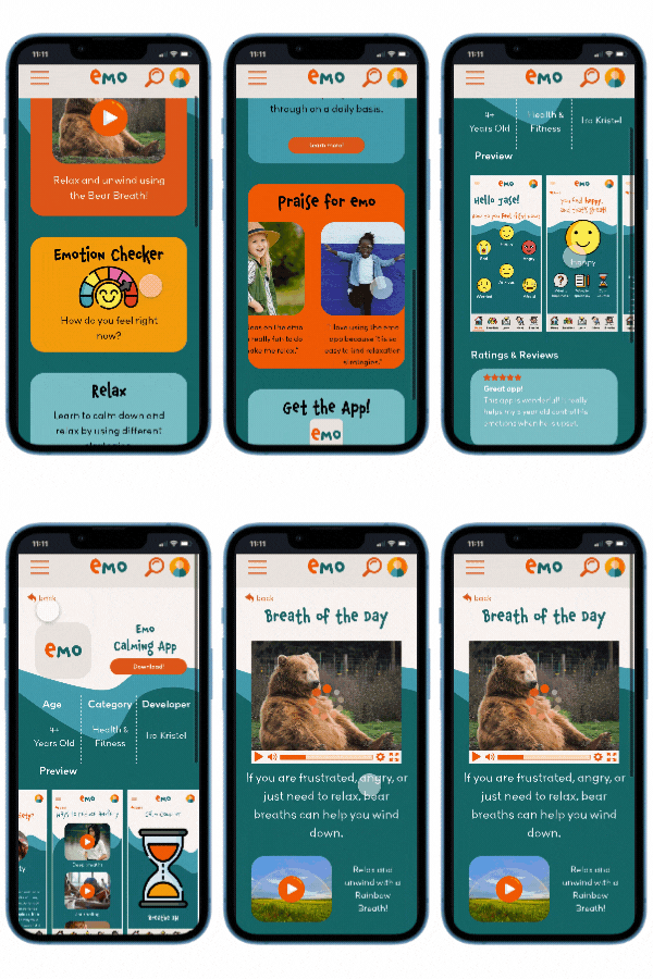
mobile web mockups

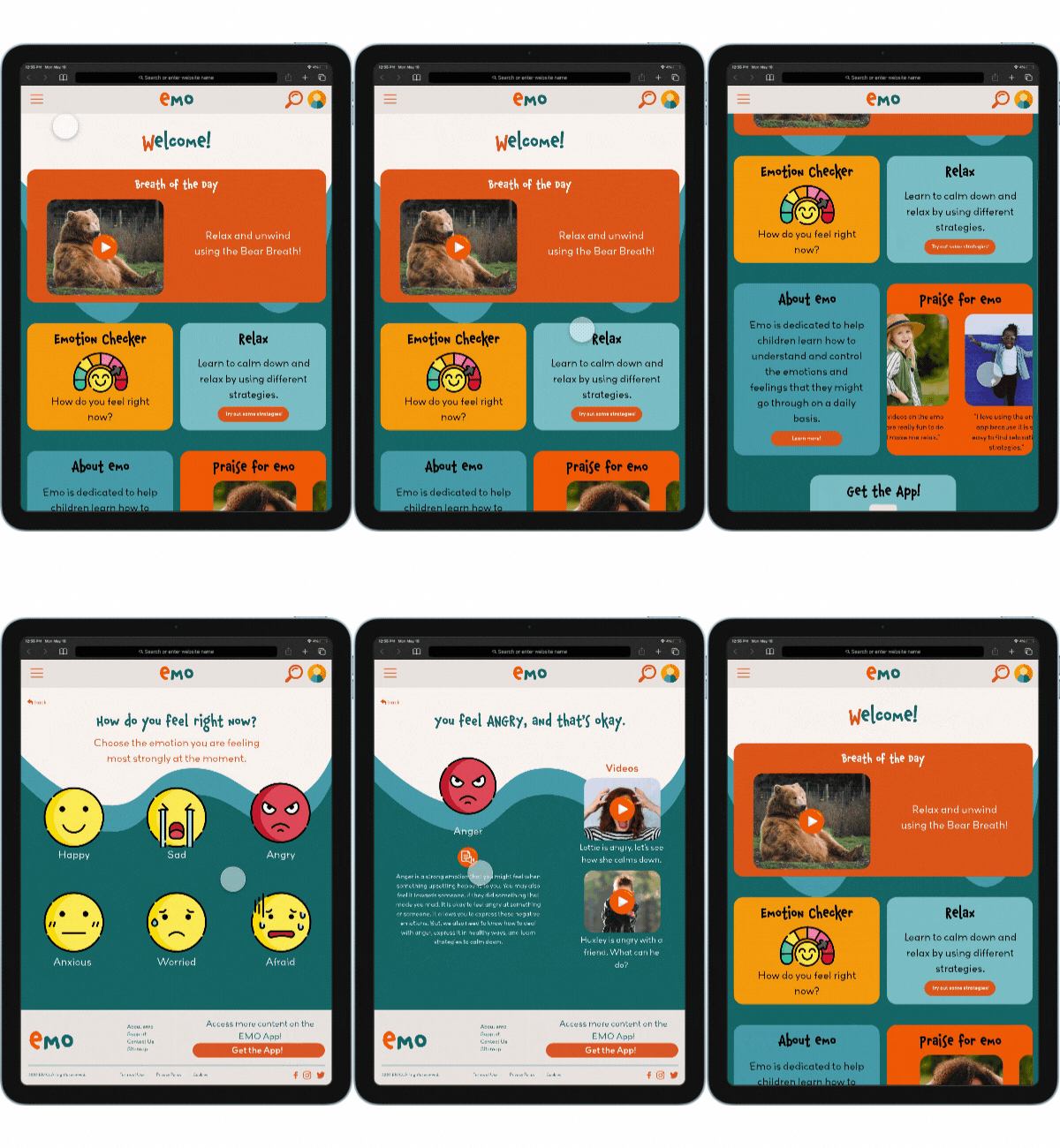
tablet web mockups

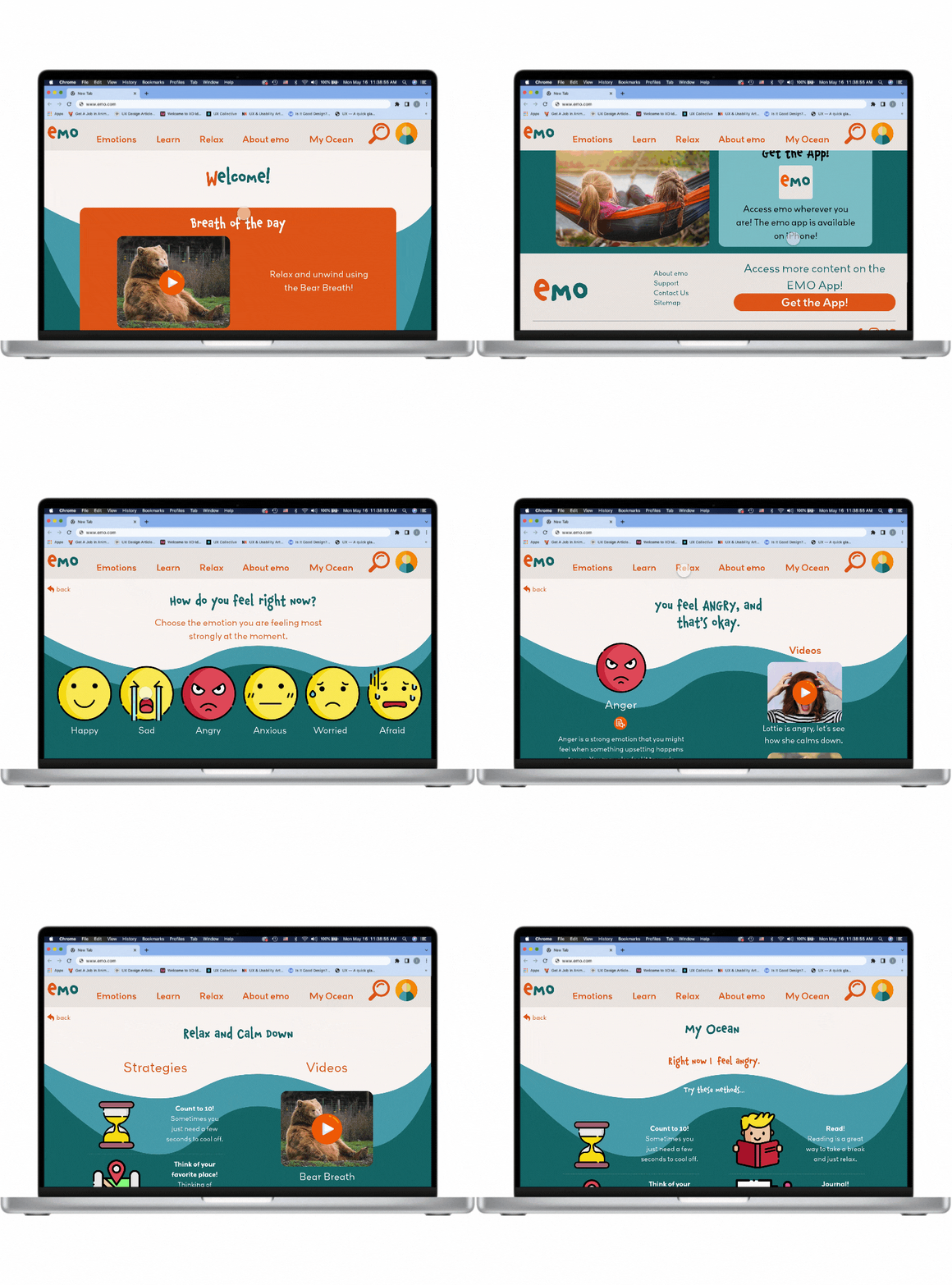
desktop web mockups
mobile web high-fidelity prototype
This high-fidelity prototype is for the mobile web version of EMO.
tablet web high-fidelity prototype
This high-fidelity prototype is for the tablet web version of EMO.
desktop web high-fidelity prototype
This high-fidelity prototype is for the desktop web version of EMO.
Takeaways
Impact:
Users really liked the concept of the app and thought it could be really helpful with managing emotions and understanding their feelings better.
“I get angry a lot and I like how this app shows breathing videos so I can calm down.”
-participant from usability study
What I learned:
I learned that a lot goes into creating an app for social good, especially if the users are predominantly children. Seeing the app and responsive website from their perspective, I definitely ideated on the designs a handful of times to meet user needs and expectations.

Next Steps
Thank you!
Thank you for taking your time to review my work on the EMO app and responsive website.
If you would like to see more, or get in touch, my contact information is provided below.
Email: irakristelcaro@gmail.com
Website: https://www.irakristel.com/


